Refine the brand identities and messaging for the Nitto ATP Finals and Next Gen ATP Finals. Integrate elements of the ATP’s “It All Adds Up” campaign while preserving the strong recognition, equity and individuality of each tournament.
The Insight
Both tournaments already had clear, established identities. The opportunity wasn’t to change them, but to evolve them – creating a stronger visual and verbal connection to the ATP master brand while allowing each event’s character to remain clear and distinct.
The reponse
Evolution, not revolution.
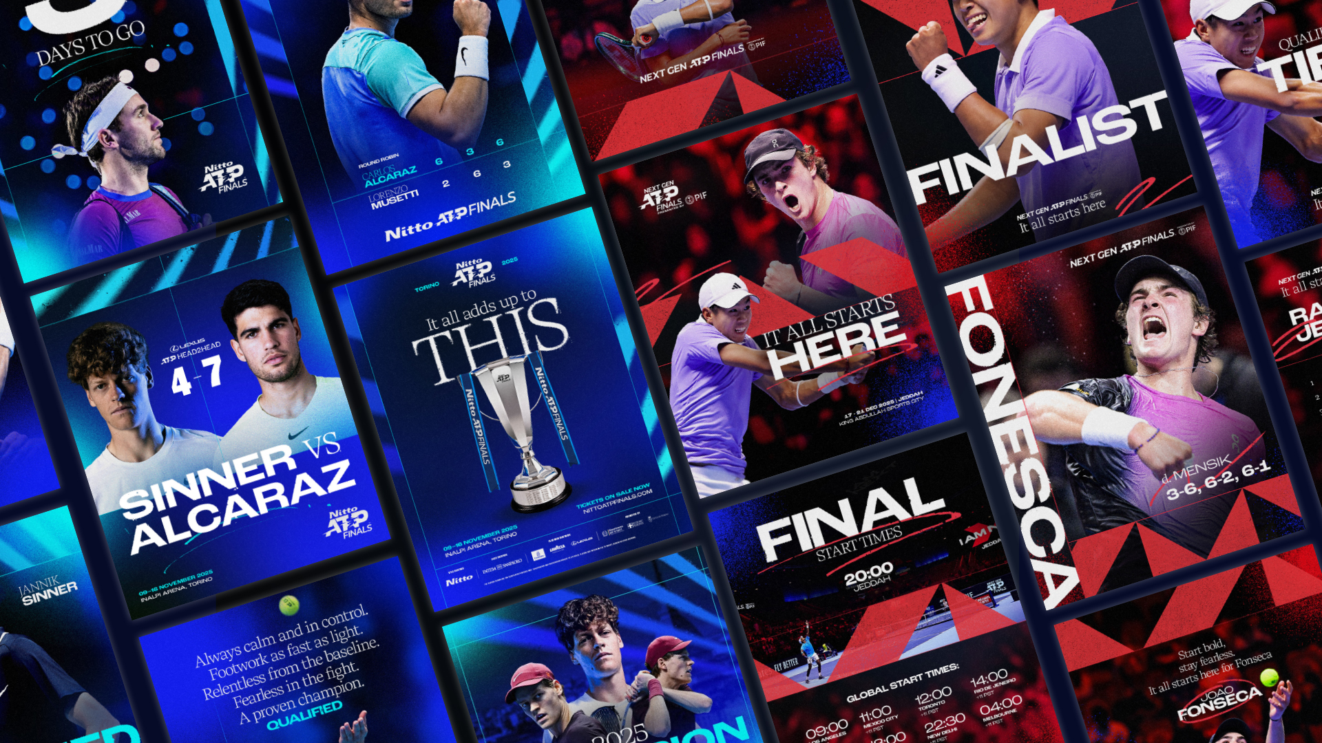
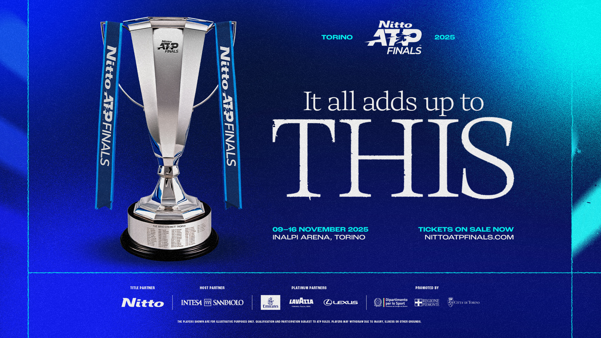
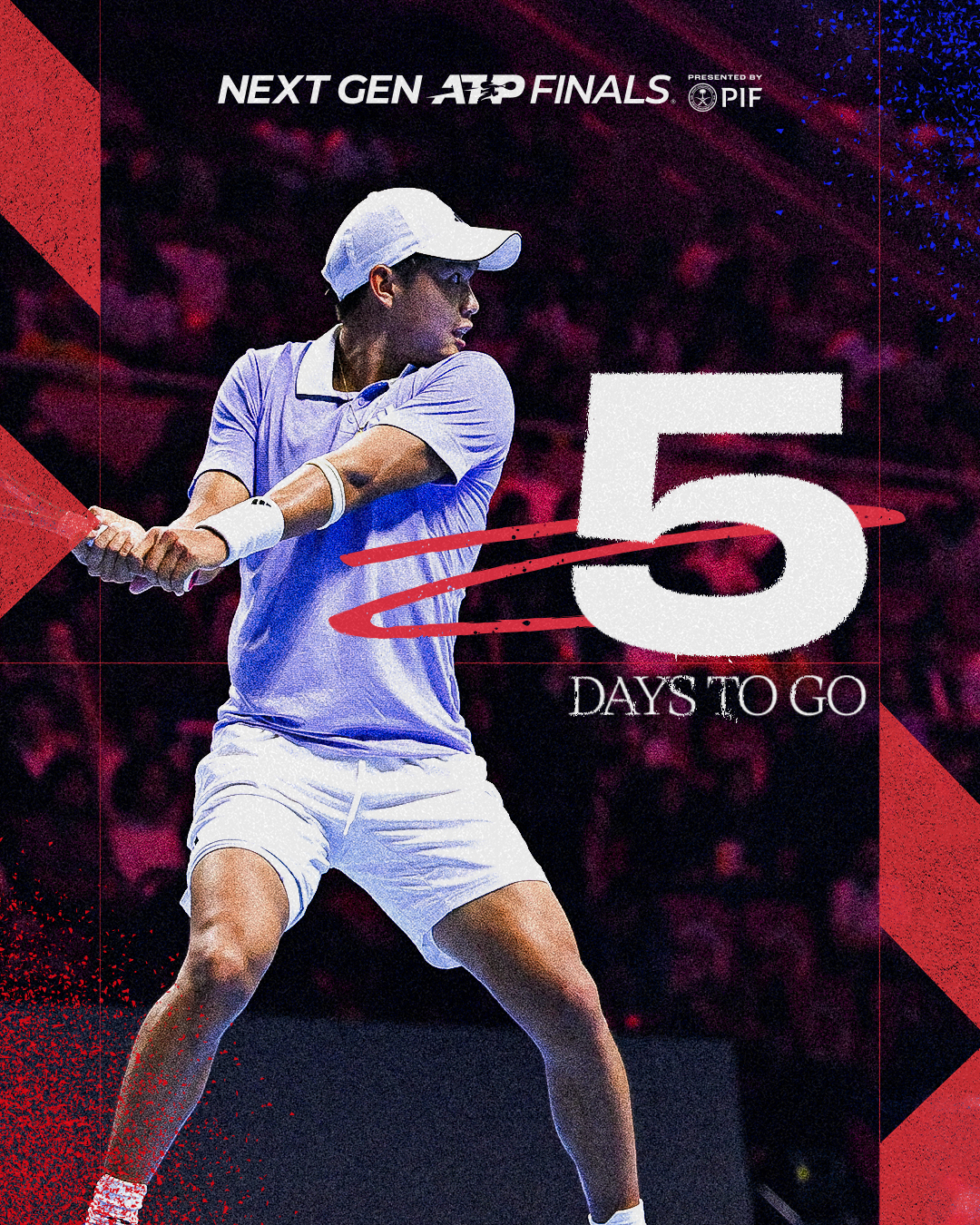
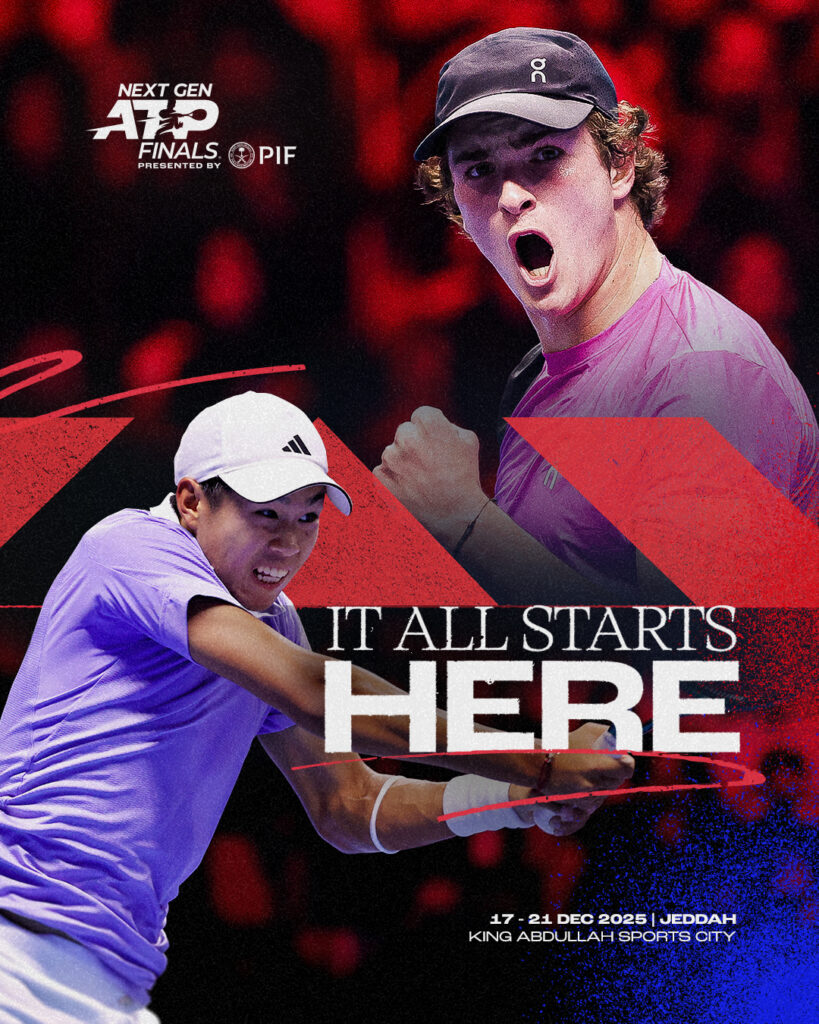
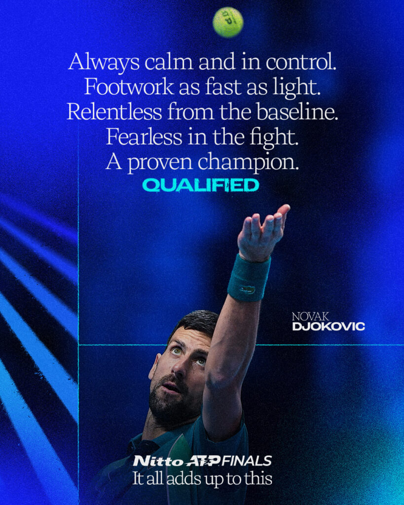
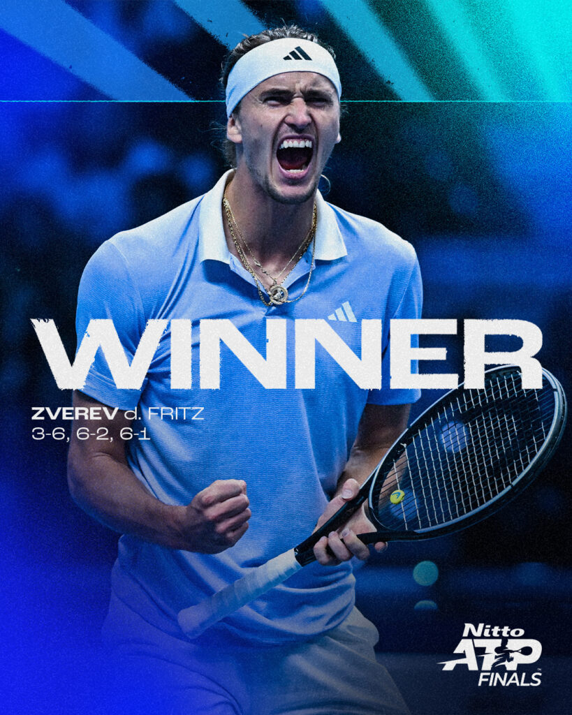
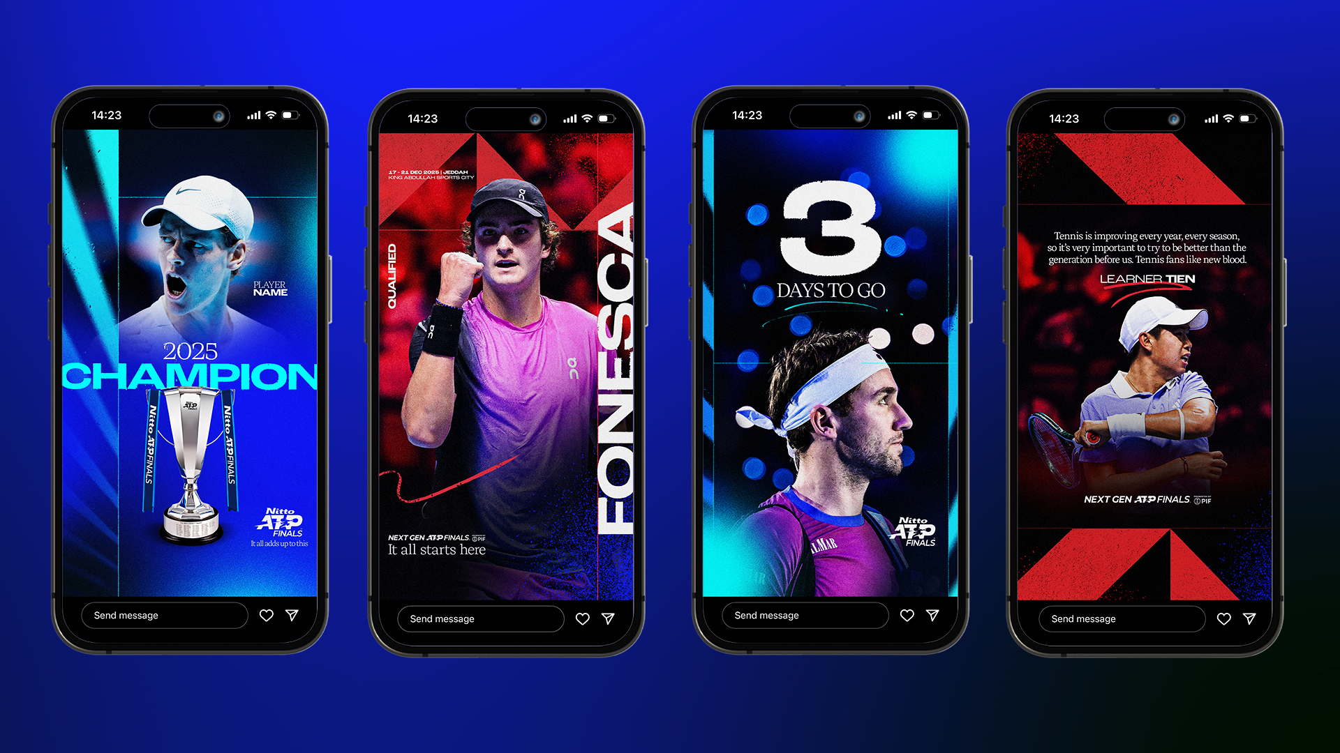
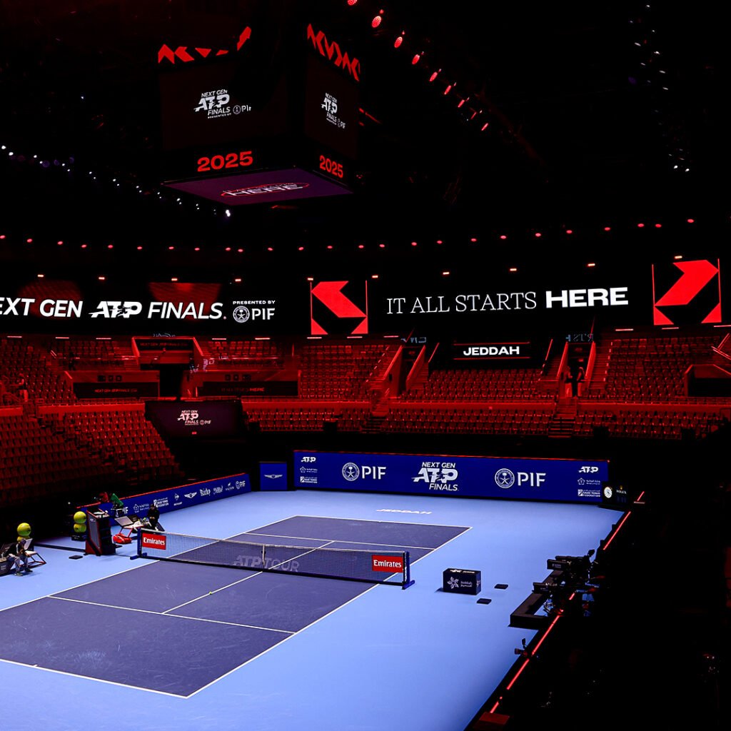
We kept key brand equities in place, including colour and typography, and introduced new design layers that aligned both events with the “It All Adds Up” campaign world. Shared structures and graphic principles created consistency, while bespoke treatments ensured Nitto and Next Gen continued to feel different in tone and energy.
In parallel, we developed a new messaging system for each tournament. We replaced legacy lines with a single, future-facing headline per event, supported by a flexible copy framework designed to work across key moments, player stories and live event use.
We delivered refreshed identities, hero key visuals, social templates and interactive brand guidelines – all built to be flexible, easy to use and consistent across partners and platforms.
The outcome
Both events now sit clearly within the ATP brand family while retaining their individual positioning. The work gives ATP a coherent, scalable system that can flex year-on-year across event touchpoints, socials and OOH.