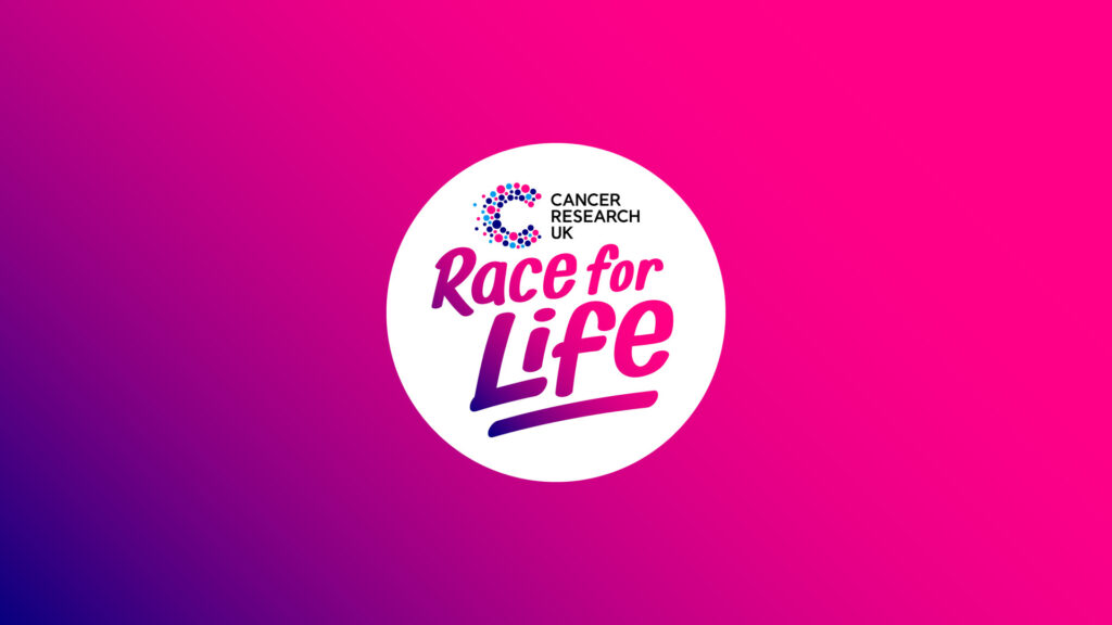
Cancer Research UK sought our expertise in rebranding its iconic Race for Life event, which over the last 30 years, has successfully raised nearly £1 billion in sponsorship, making it a cornerstone in the fight against cancer.
However, as the mass participation landscape evolved, the brand faced challenges in maintaining its competitive edge. Responding to this, we have taken the Race for Life through a comprehensive rebranding process, with the aim of propelling the brand into a new era of mass participation and community engagement.
The reimagined brand features a dynamic logo and brand world that injects fun, enjoyment, and progressiveness into the Race for Life identity. The design draws inspiration from the qualities of ‘togetherness’ and ‘progress’ within Cancer Research UK’s mission, fostering a shared visual language that showcases progression, transformation, as well as the unique magic of a Race for Life event. Another key element of the rebrand includes moving away from a purely pink palette and breast cancer-centric imagery to represent and support all cancer types.
Emphasising the magical experience of participating in the event, encapsulated by the slogan “moving together is surprisingly moving,” the rebrand led to a complete evolution of the brand identity. Inspired by the handwritten signs on participants’ backs, the design creates a strong sense of personal connection.