
Rebrand
ENGLAND FOOTBALL
Football is for everyone
Let’s go back to where we started
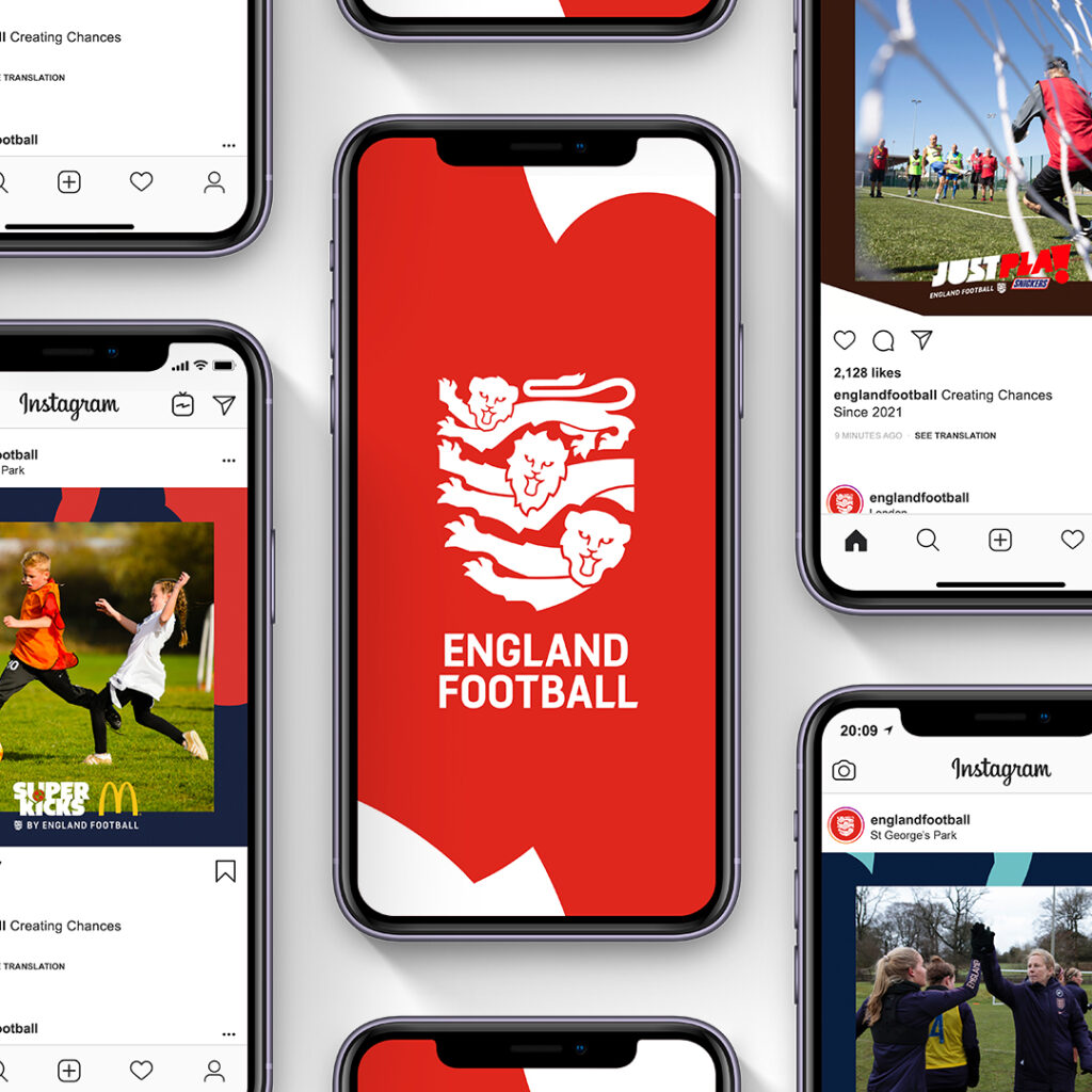
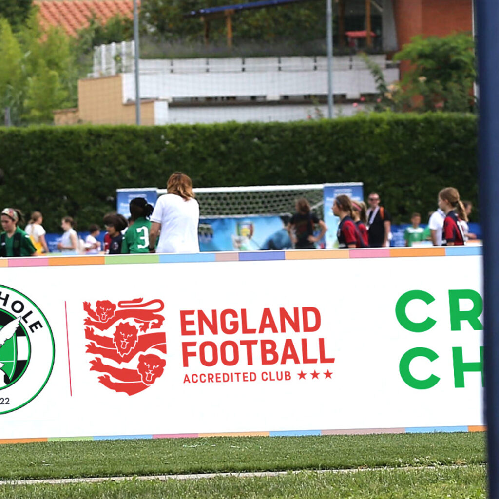
Within a month of launch the brand had achieved
62% awareness
amongst parents of youth players.
Let’s go back to where we started
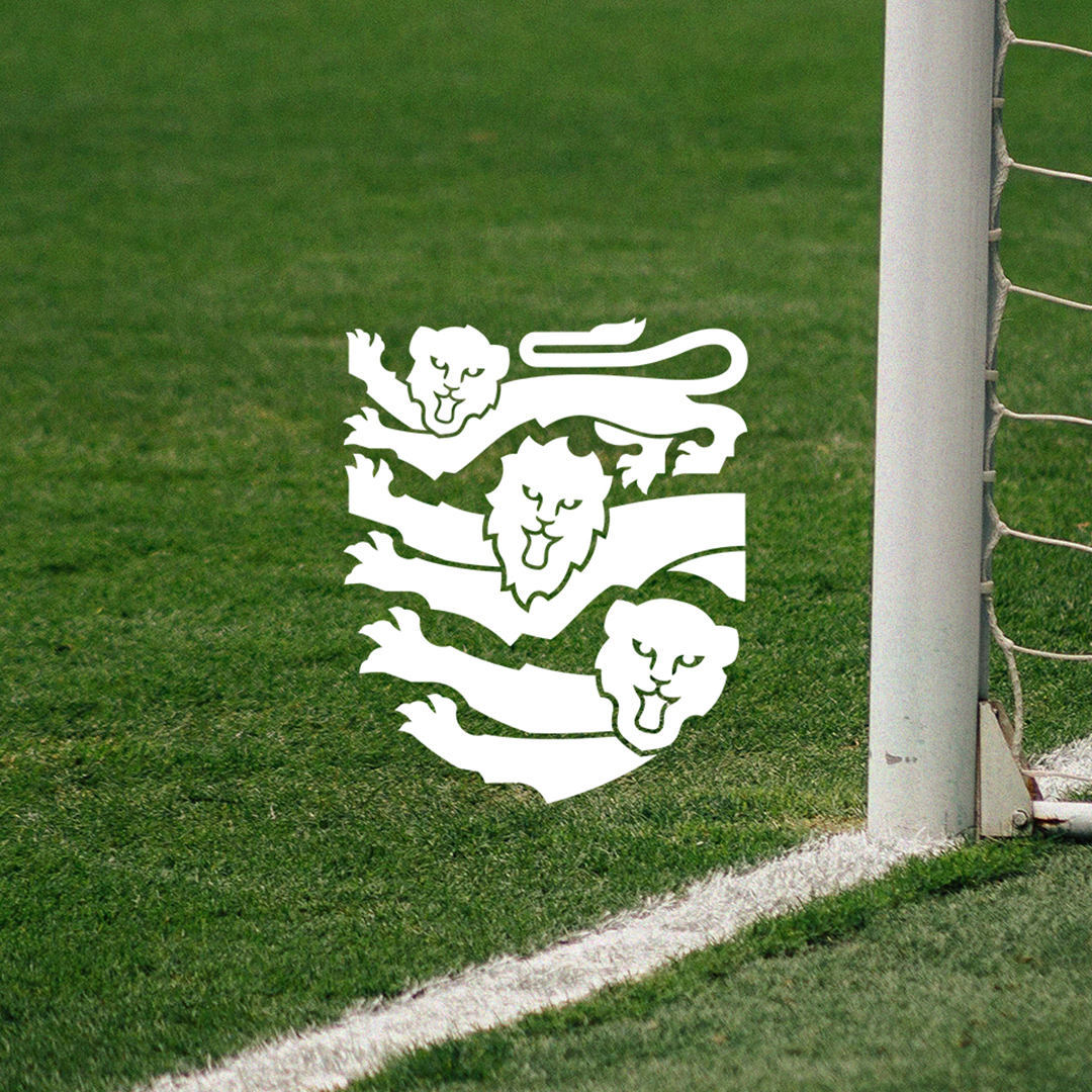
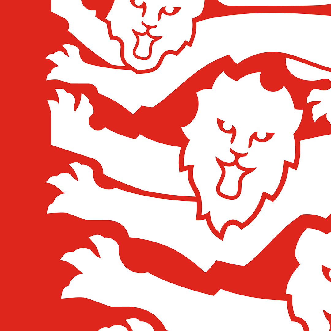
We used the famous FA three lions crest as a starting point, adapting it into a cub, lion and lioness – representing everyone at every level of football across the country. The border around the crest shape was removed, to make the community feel accessible, with no barriers to entry.
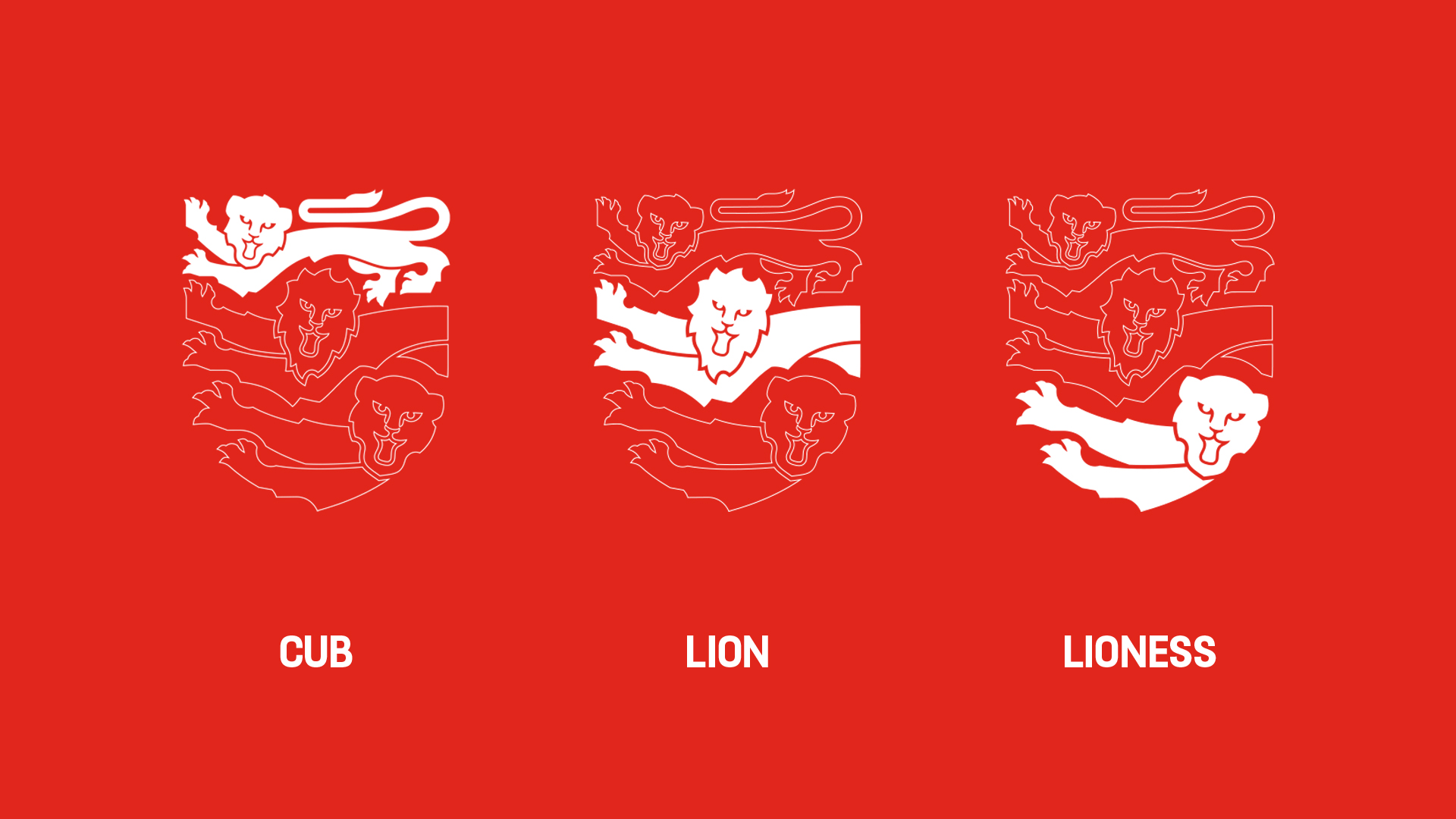
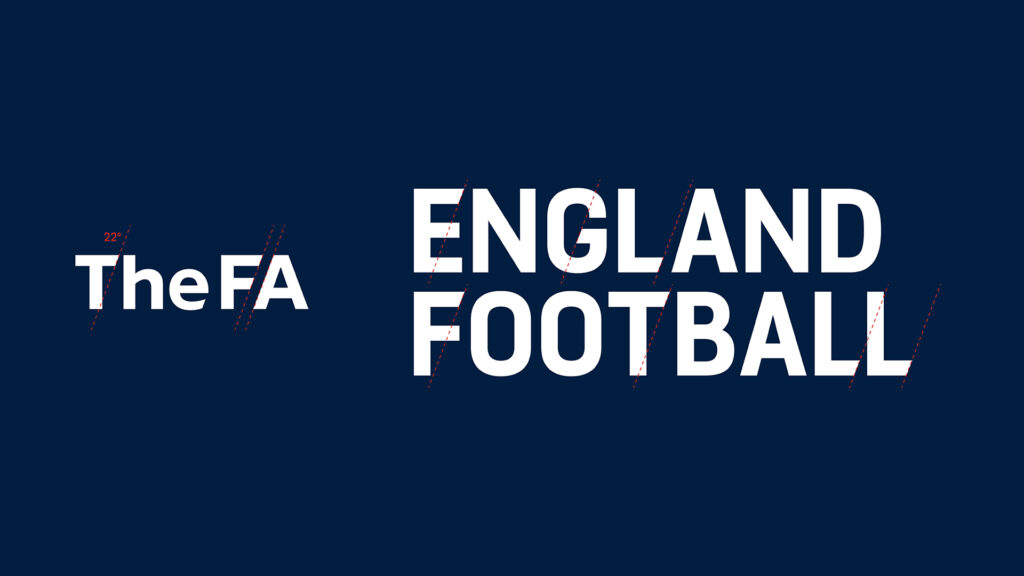
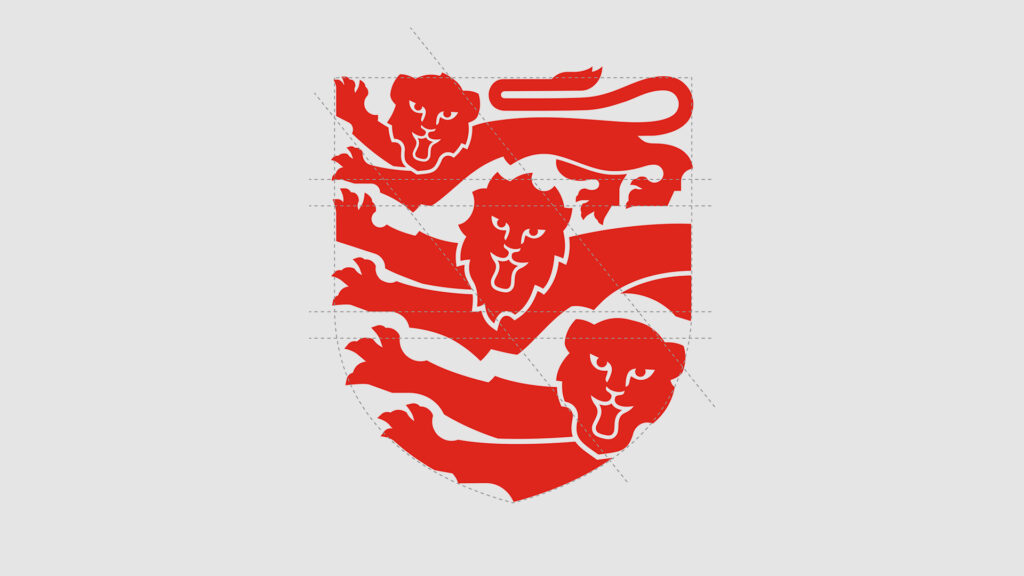
Evolving a legendary logo to mean more
Using the positive energy of the red from the St. George’s cross, and crops into the lion shapes to create graphic elements, we shaped a brand that’s contemporary, sporty and resonant.
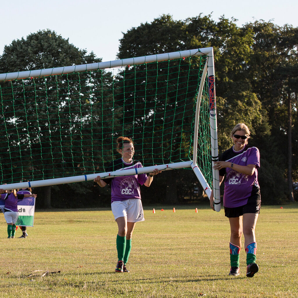
The England Football logo and brand suite aims to represent and harness greater inclusivity across the English game and reflect a broader, modernised version of English football, giving the Three ‘Lions’ new meaning and purpose, representing every man, woman, and child in England.
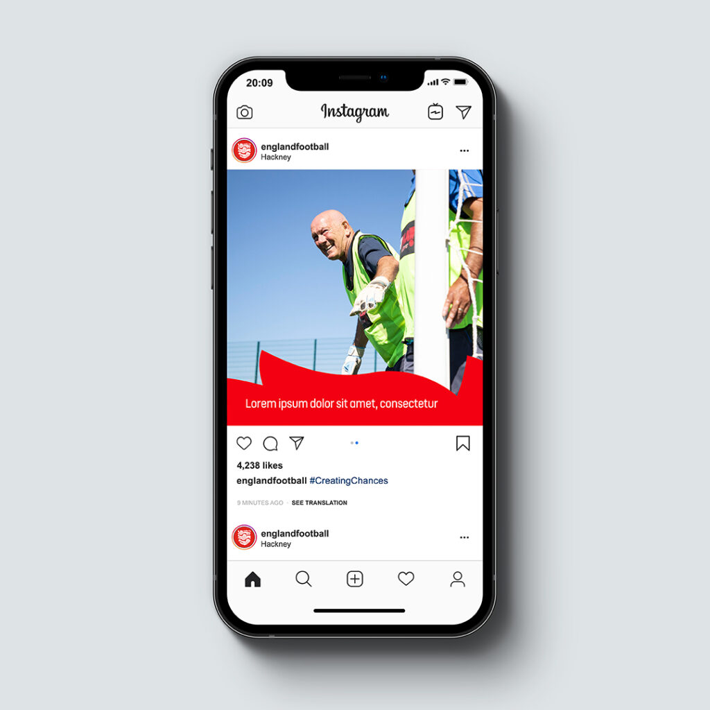

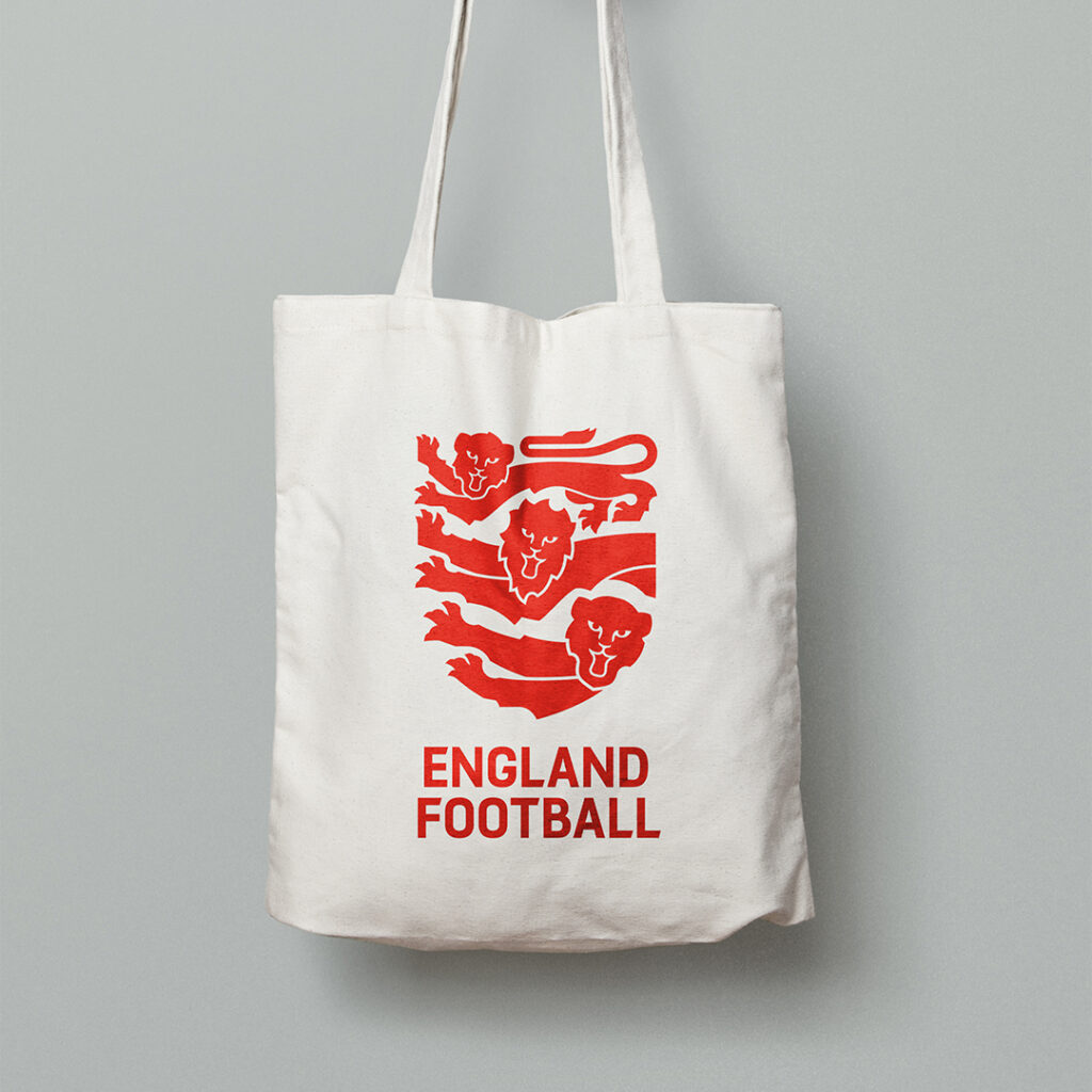
Inspiring new players to get on the pitch
Within one month of launch the brand had achieved 62% awareness amongst parents of youth players and 51% awareness amongst adult players; achieving a positive sentiment score of 86% amongst all football fans.
Club registrations also increased as a result of successfully completed journeys through the new Find My Football website, as part of EnglandFootball.com, with more than 4000 new players registered. Additionally, the ‘my England Football’ membership scheme welcomed 185,000 new members into the England Football family – 23% above its anticipated target.
