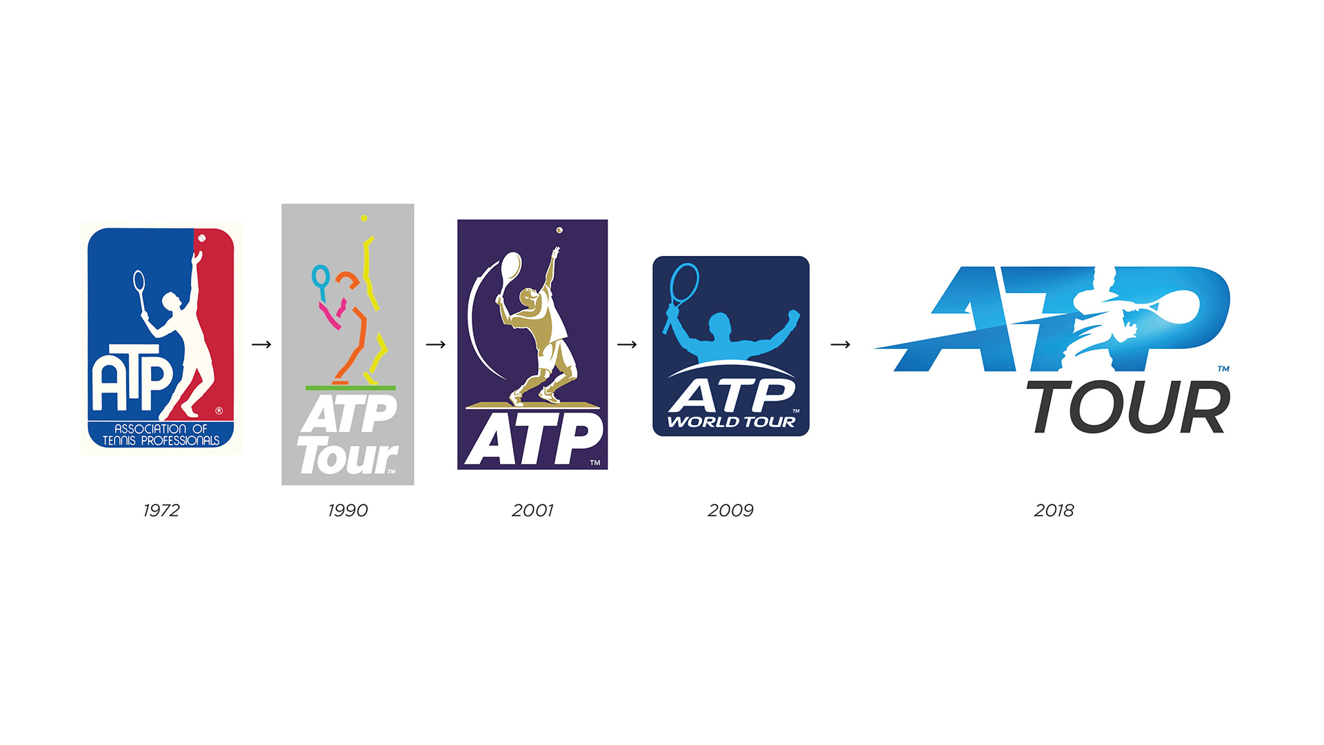
After 10 years the ATP wanted to update their brand identity to support their journey from ‘governing body’ to a ‘sports entertainment brand’. They wanted their brand world to be imbued with an energy and power – an embodiment of their leading players fit for the digital age.
Making a mark
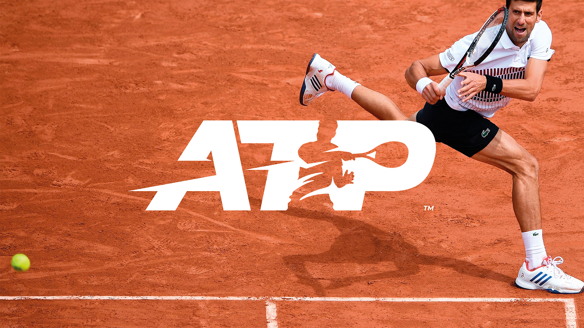
Our research indicated that not all sports fans would know that ATP was a tennis brand – so placing a visual of the sport directly in the logo made perfect sense. We also needed to make sure our logo was instantly recognisable while still working well with sub-logos and standalone brands.
This revolutionises what we represent completely. MATTA have taken us from governing body of one sport to an entertainment brand ready to compete with the likes of F1, NBA and WWE.