England Cricket represents more than a single team. It spans the England Men’s, England Women’s and England Disability teams, each playing across the Test, ODI and T20 formats. But despite sharing a badge, there was no shared brand identity.
The ECB asked MATTA to create a new brand identity for England Cricket. One that could unify all teams and reflect the game’s rich heritage, while modernising how England Cricket shows up.
Ultimately, the rebrand needed to help more people see themselves reflected in the national game, so they could feel more connected with the teams.
Connecting with what matters
We conducted interviews with players, fans, ECB staff and stakeholders. Fan segmentation and behavioural analysis gave us a sharper understanding – while each team and format had its own story, what united them was stronger.
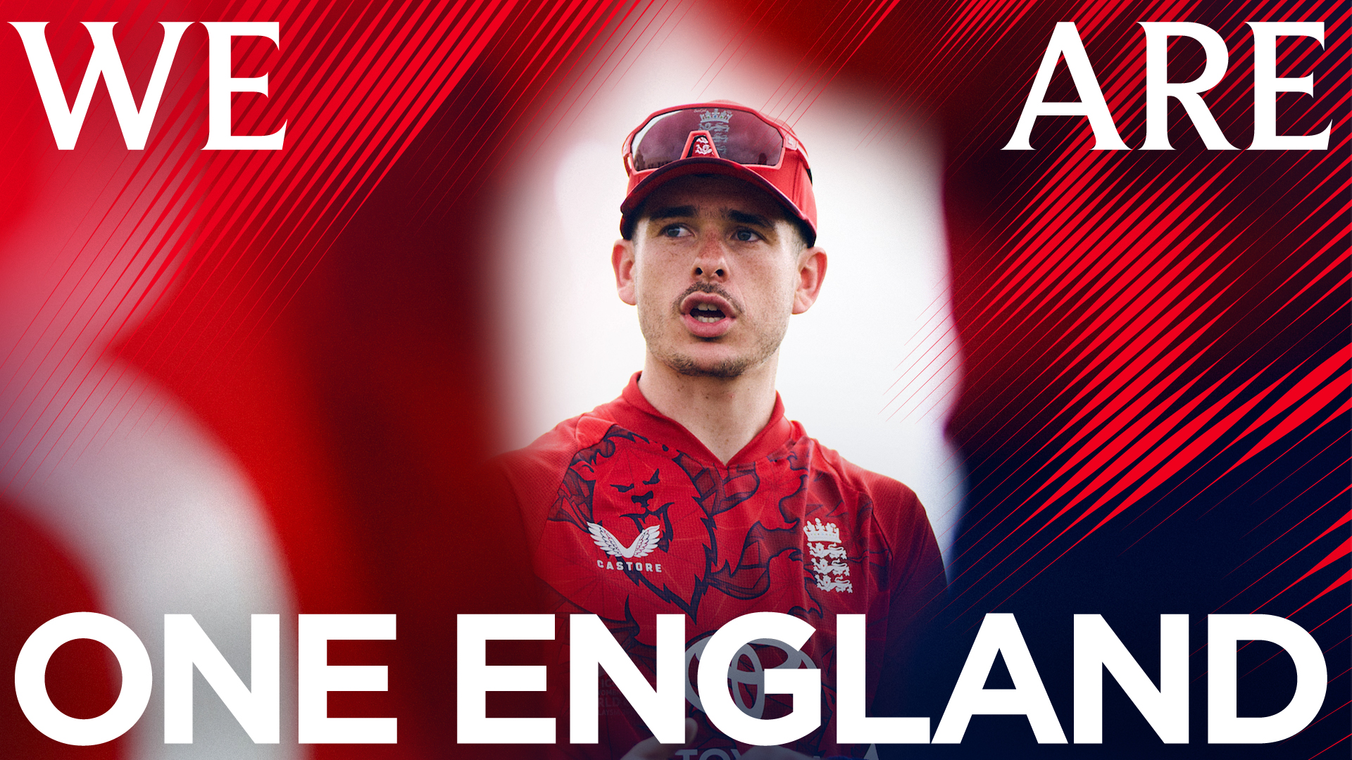
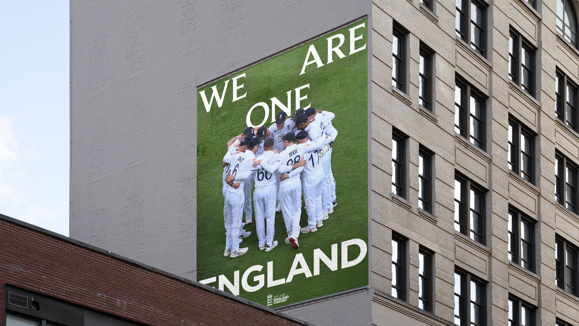
The new brand needed to elevate this idea of One England. Not by flattening difference, but by celebrating what binds the teams together and ensuring every fan felt invited in.
A refreshed brand
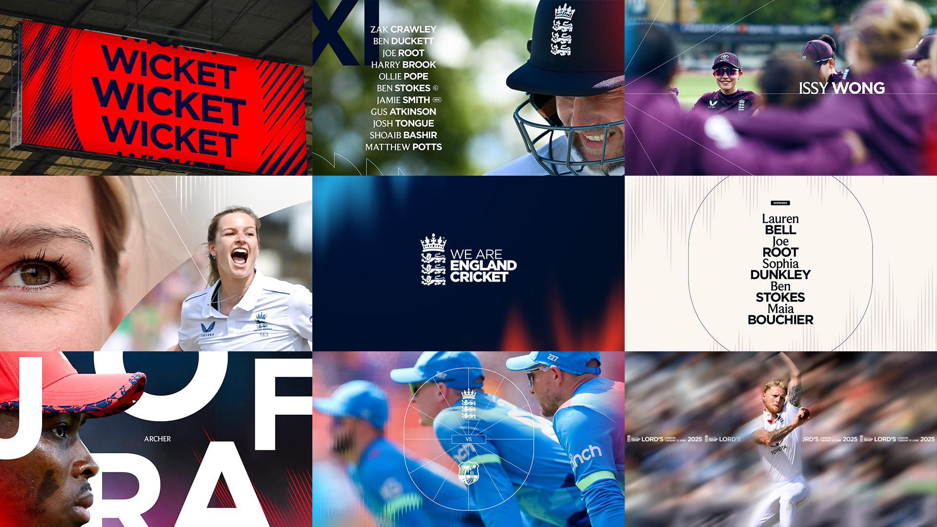
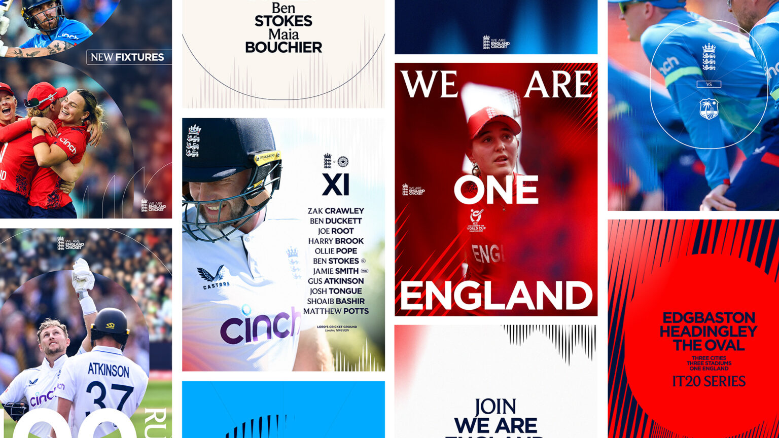
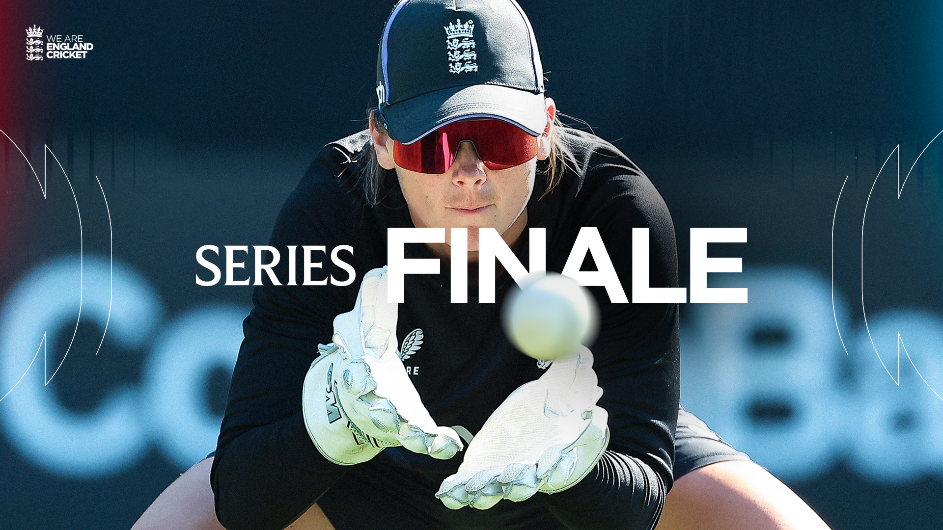
We created a bold new identity for England Cricket. One that brings together all formats and teams, while giving each the space to express its own character.
Speaking consistently with a ‘Tones of one voice’
The Tones of One Voice playbook underpins the brand, shaped by the three core values. It offers a unified way of speaking across all teams, formats, and channels, ensuring every expression is unmistakably One England.
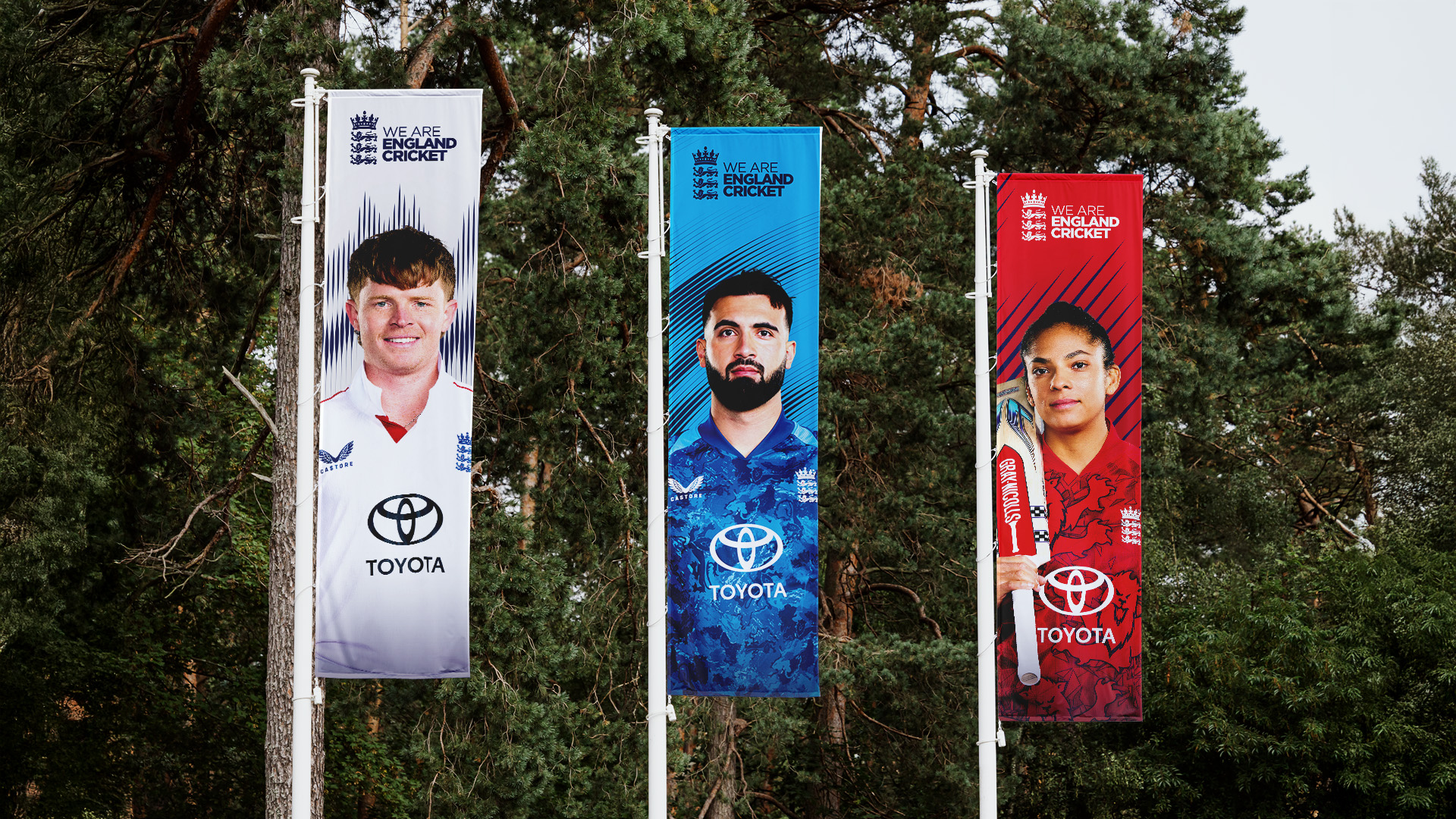
While the voice remains consistent across all communications, it flexes in tone to recognise the nuances and individualities of each team and format. For example, distinguishing between the key messages for England Men, England Women and England Disability, as well as adjusting language and copy length to best represent each format.
A visual identity inspired by the game itself
Visually, the identity draws on the rich traditions of the sport but reimagines them in bold, modern ways. The design layout is inspired by the technical aspect of cricket including the pitch structure (the field, the middle) and the wagon wheel.
The more expressive design language evolves the use of the lion. While it’s always been part of the crest, a visual representation of a lion’s roar is now a core part of the brand identity, symbolising the pride, unity and courage that defines all three teams.
Much like the tones of one voice, the visual identity flexes across different formats, allowing the unique energy of Test, ODI and T20 cricket to come through, while still looking and feeling part of the same brand.
A platform for the future
The new identity launches alongside the announcement of the 2026 fixtures, where England Men and Women will both host India across all three formats. It follows the landmark summer of 2025, when, for the first time, England Men, Women and Disability teams played overlapping home series against the same opposition.
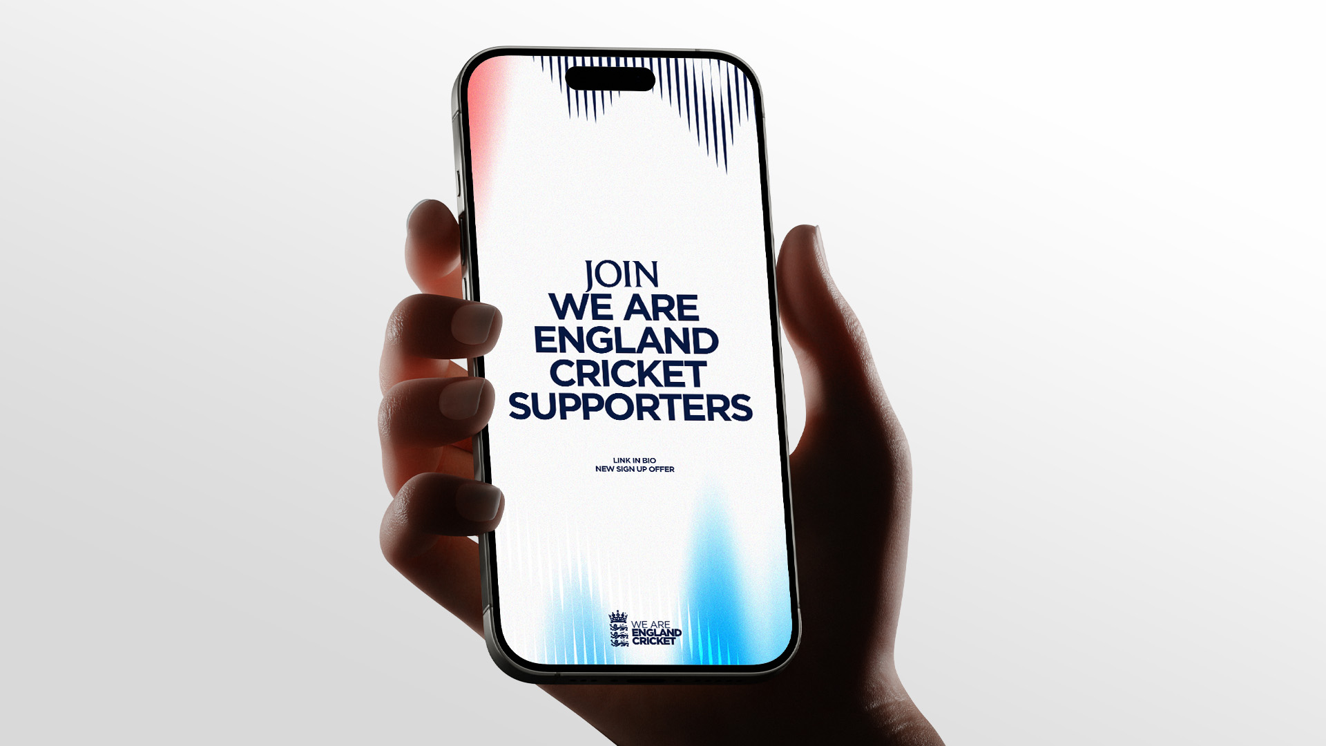
The rebrand will roll out across all fan-facing channels: digital platforms, social, merchandise, and in-bowl graphics, setting the tone not just for elite performance, but for community engagement and the future growth of the game.