Rebrand
World Climbing
The Challenge
Climbing has risen fast – founded in 2007, gaining Olympic status at Tokyo 2020, and receiving wide attention at Paris 2024. With new Olympic formats coming and Para Climbing debuting at LA 2028, the brief was clear: create a new global brand that felt inclusive, contemporary and future-facing – one that could unite athletes, fans, federations and partners under a single, powerful identity.
The Insight
Climbing isn’t learned, it’s instinctive. Hardwired into us long before walls, rules or medals, it’s a movement everyone, everywhere can relate to. Individual yet communal, primal yet modern, climbing unites people across cultures, ages and abilities – a universal human behaviour elevated into a global sport. That truth sparked the brand purpose: we get the world climbing.
The Response
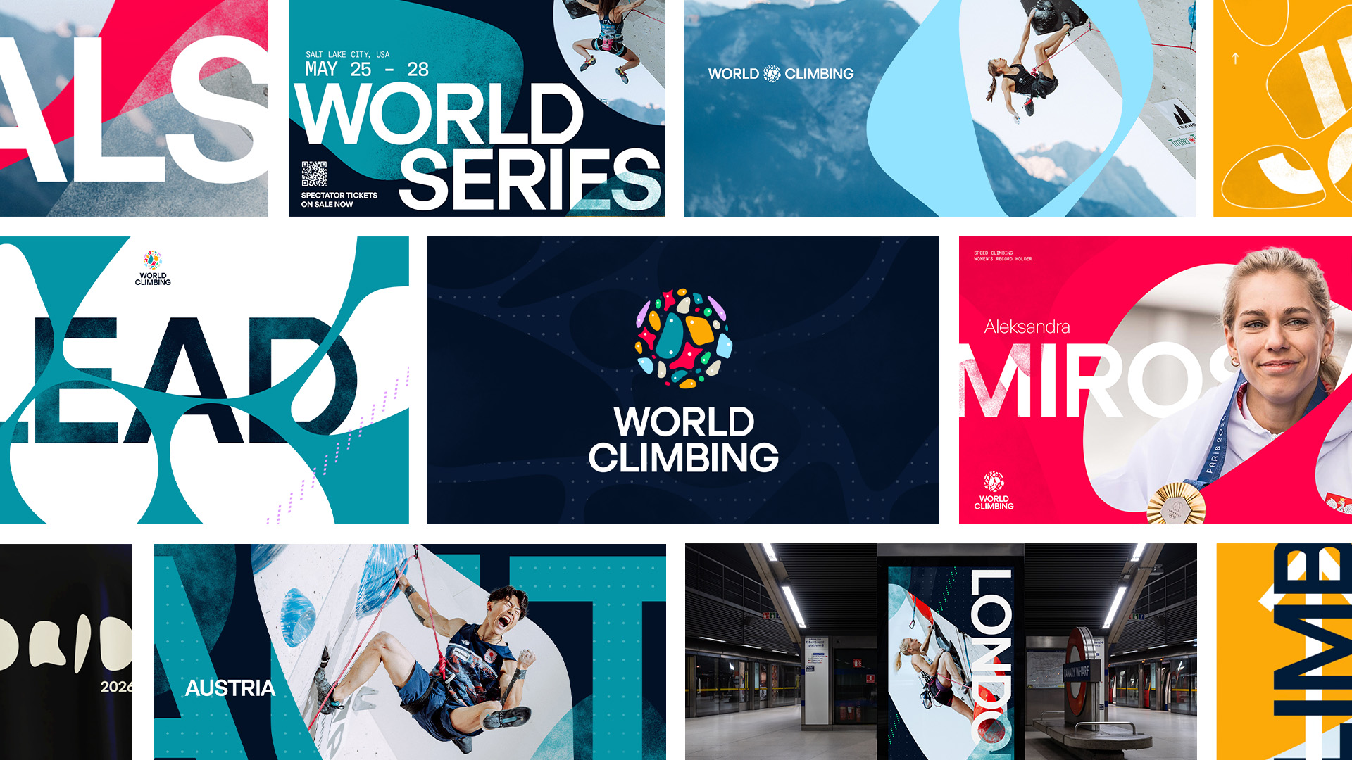
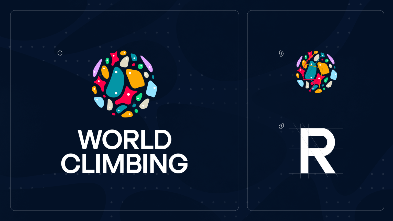
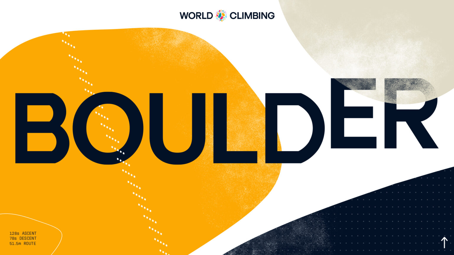
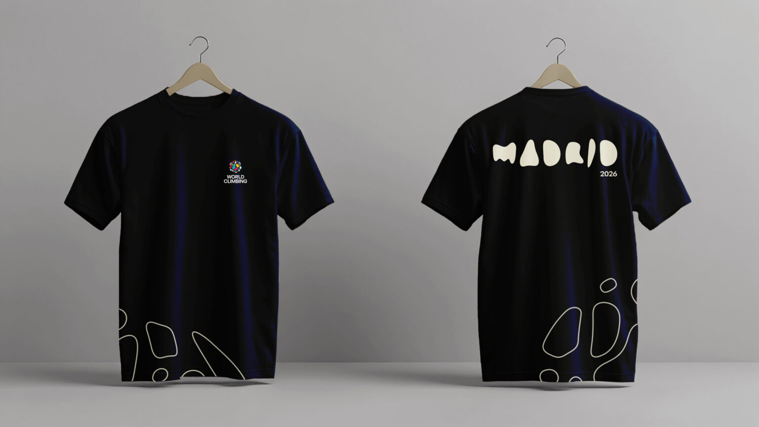
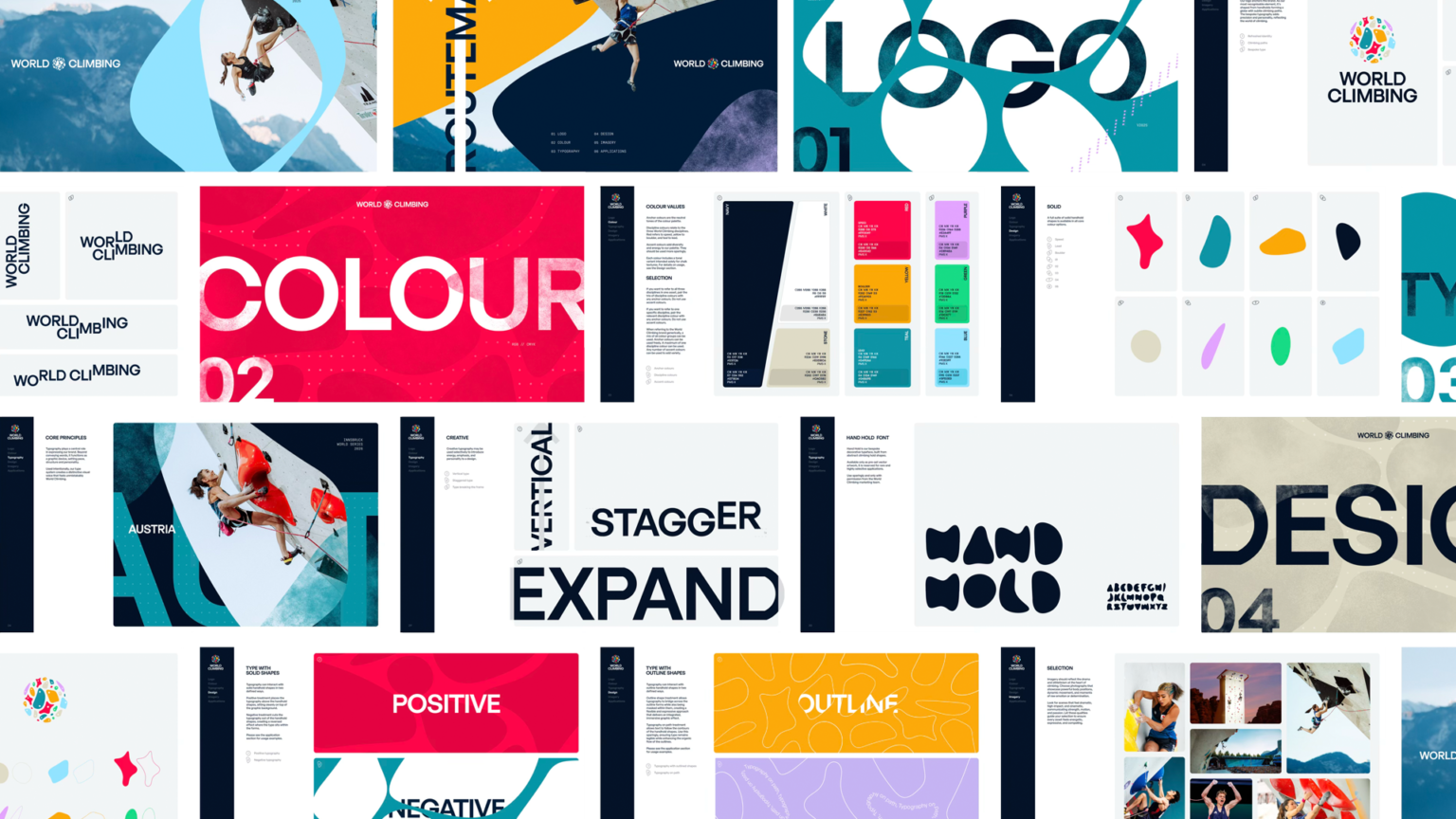
We created World Climbing, a bold master brand drawn straight from the sport itself. The logo is built from the handholds and footholds of Speed, Lead and Boulder – three routes, one shared ascent to the top. A custom typeface, inspired by climbing holds, embeds the sport’s DNA into every letter.
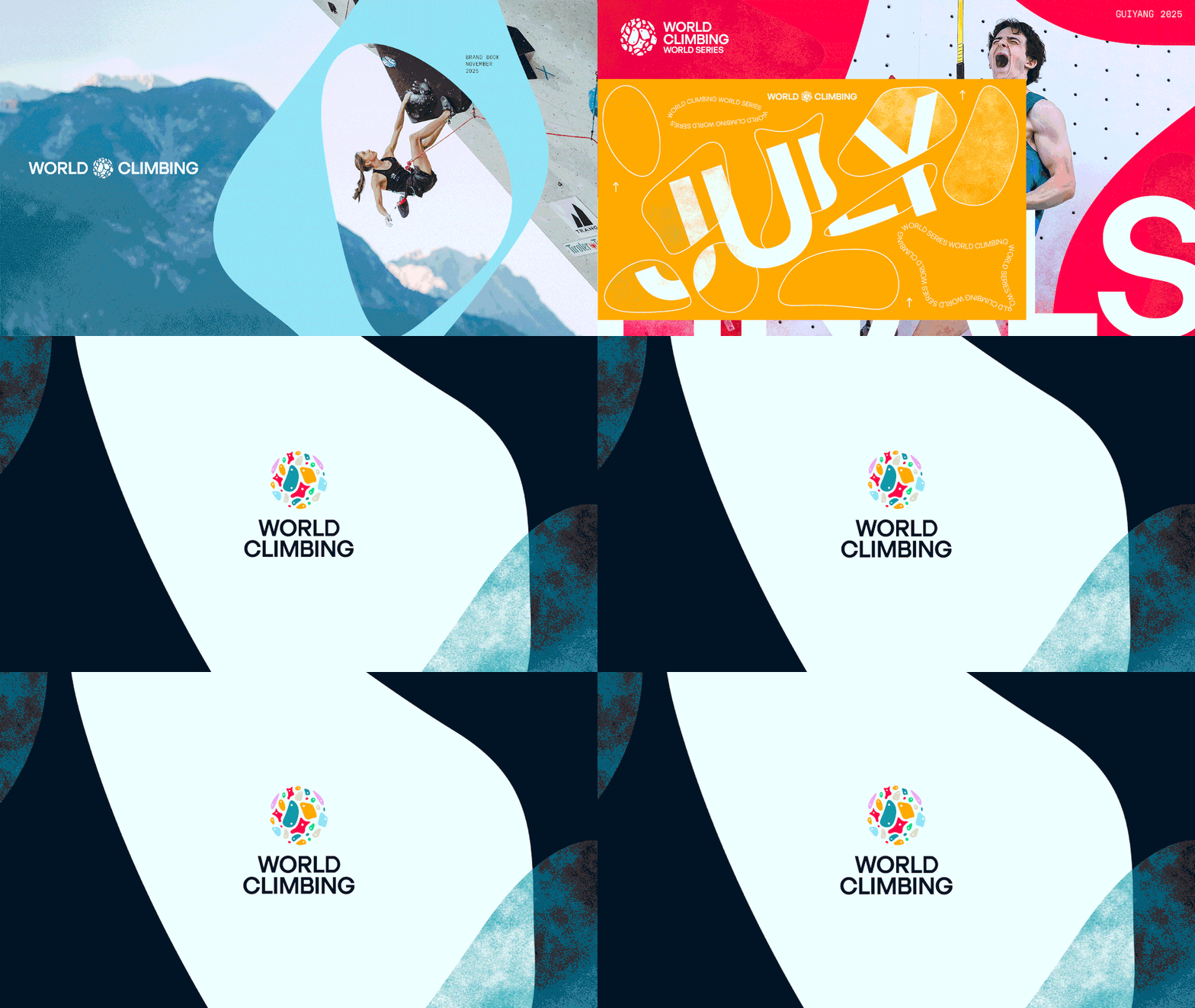
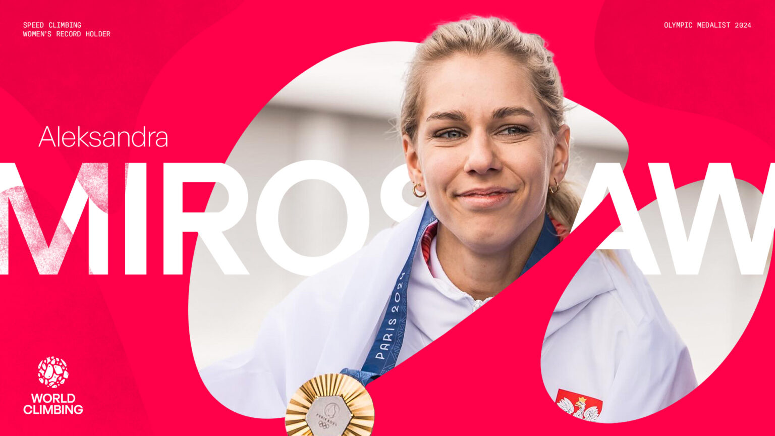
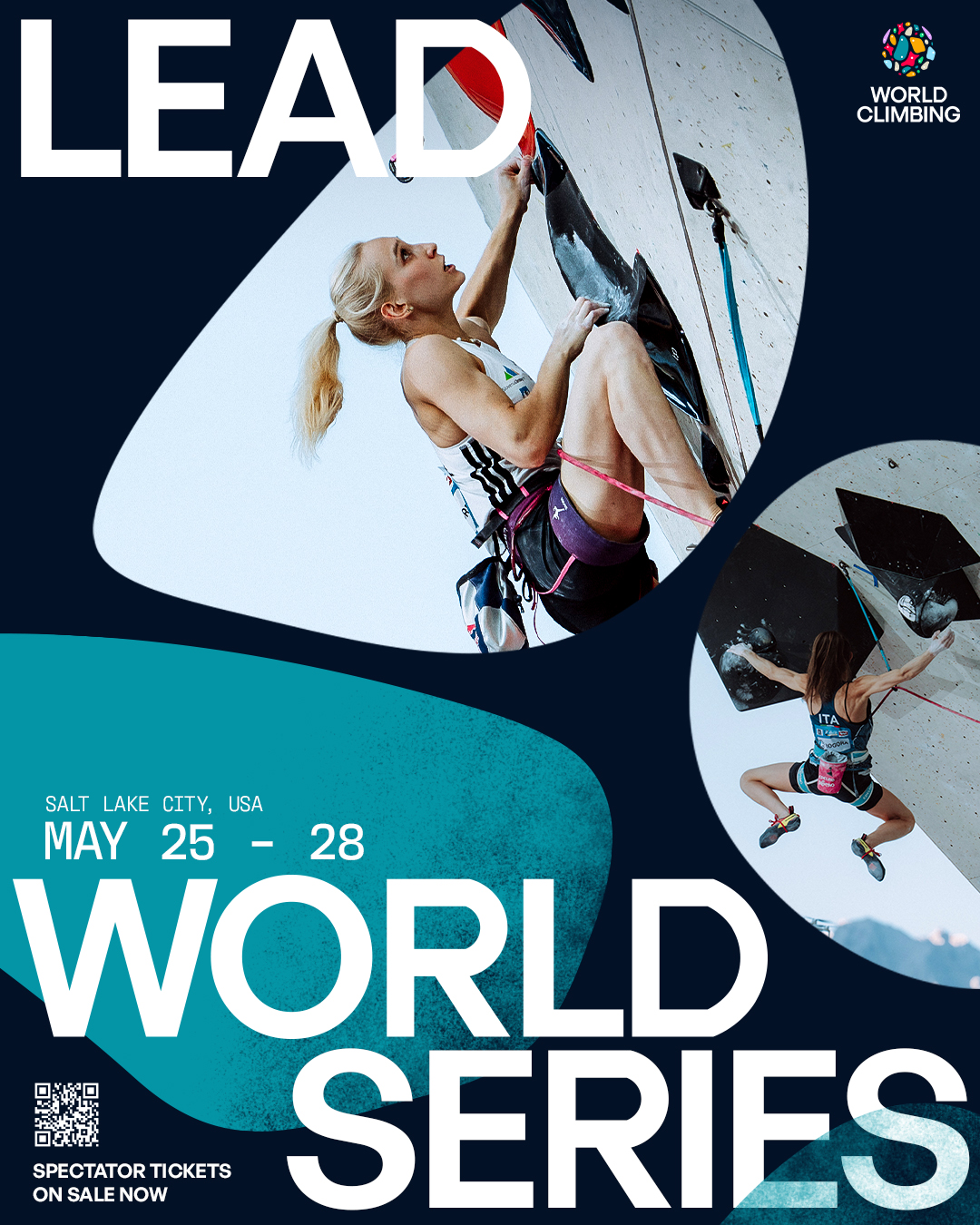
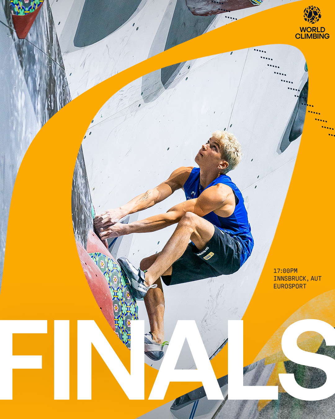
The wider visual world brings climbing to life: chalk textures, rope-like accents, dynamic gradients, and handhold-shaped negative space. The system is energetic, inclusive, and instantly recognisable. Paired with a confident, human verbal identity, the brand speaks to elite athletes and first-time climbers alike.

With MATTA we were able to truly capture the essence of our sport and the sensation of being at one with the wall. The details were deftly crafted to be evocative and meaningful across all three of our disciplines – speed, lead and boulder. We created a brand that was both instantly recognisable and resonated strongly with our fast growing and equally inclusive community of climbers from grassroots to elite. It is a powerful enabler for us in pursuit of our purpose – to get the world climbing.
Fabrizio Rossini
Media and Communications Director