World Gymnastics logo mono white

Rebrand

WORLD GYMNASTICS

Overview of the World Gymnastics full colour logo on navy gradient background

THE BRIEF

Founded in 1881, the International Gymnastics Federation carries deep Olympic heritage – but its logo hadn’t changed since 1947. The challenge was clear: create a modern master brand that could unite eight disciplines – from Parkour to Artistic – under one global identity. One that felt energetic, inclusive and relevant, from elite competition to grassroots participation.

Gymnastics is the foundation of all movement, yet its identity felt static. Most gymnasts enter the sport before the age of seven, so the brand needed to reflect youth, possibility and momentum. This was a chance to evolve the organisation from a distant governing body into World Gymnastics: a movement that inspires, not just regulates.

Overview of the 8 World Gymnastics discipline brands, showing their logos, primary colour palette and abstract branding patterns
Annotated visual of the World Gymnastics icon in full colour on navy background
Close up of the World Gymnastic Logo showing the typography blueprint of white copy on navy background

THE INSIGHT

We started by listening. Judges, coaches and, most importantly, athletes from across the world shared how they experience the sport. Nearly 6,000 responses revealed a clear direction: gymnastics should bring inspiring movement to life.

Such a bold purpose required a striking new brand and a new name. It was time for World Gymnastics to be born.

RESPONSE

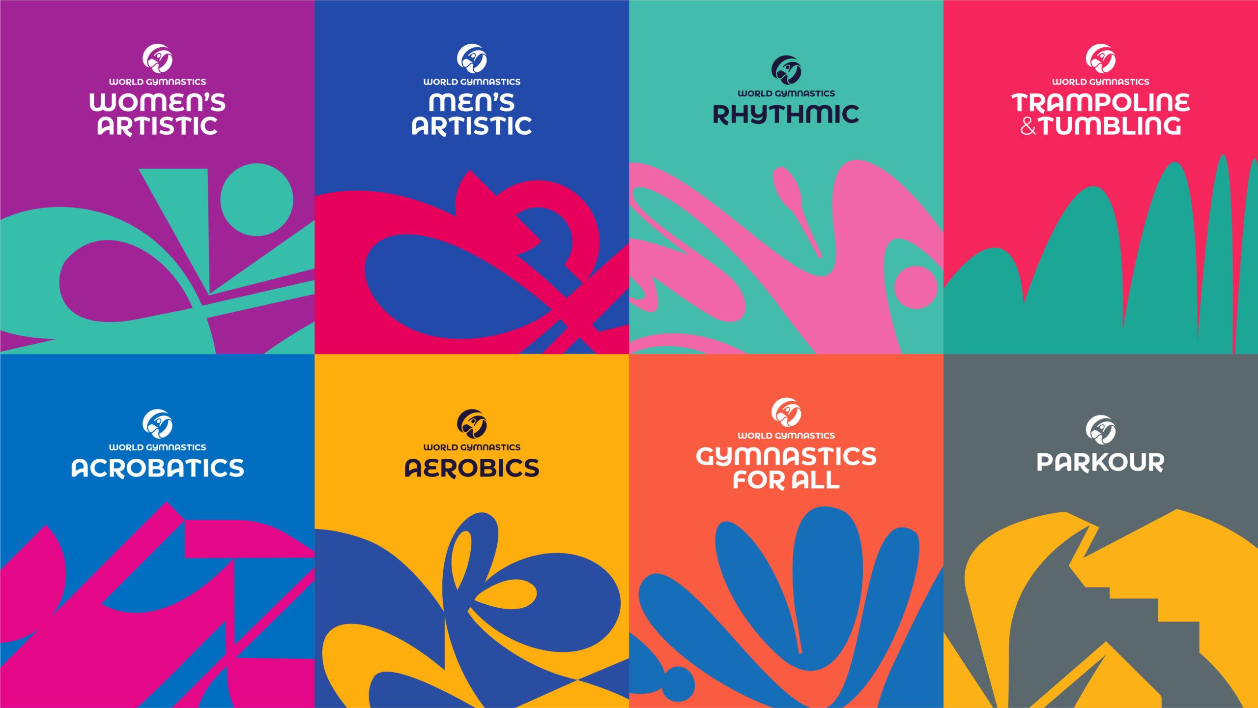
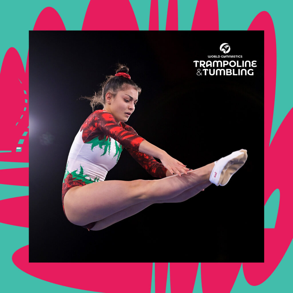
Inspiring movement became the creative driver. Working closely with each discipline’s Technical Committee, we identified what makes each one unique. Movement, equipment and attitude came together to create eight distinct yet connected brand worlds, unified by a single global system. 
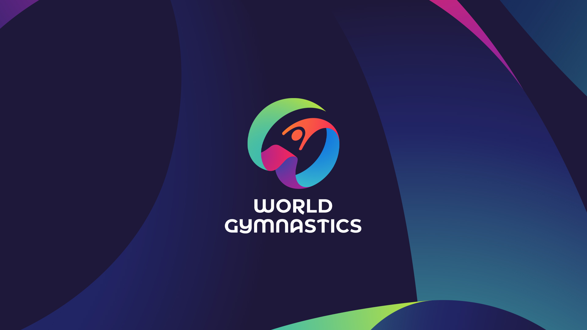
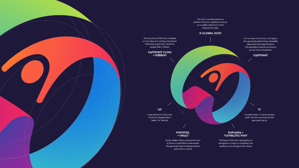
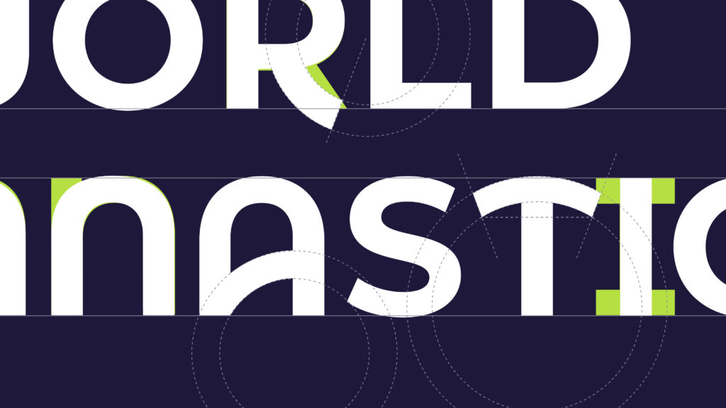
The master brand features a gymnast springing upward through flowing global motion. Bold colour reflects the sport’s youth and energy. A custom typeface, inspired by equipment and movement, anchors the system and is shared equally across all disciplines.
World Gymnastics Trampoline & Tumbling t-shirt in turquoise with pink abstract branding pattern
Mock up of World Gymnastics Women's artistic branded perimeter board as an event showing the floor in front of seated crowd
We have been able to create a fresh face, look and feel for the sport that we can present to the world: that unifies our family of disciplines, but celebrates their differences. Making them attractive options for both participants and partners alike in the future.
Yasemin Bay-Wenzel
Head of Partnerships and Marketing at World Gymnastic (formerly FIG)
World Gymnastics social post with World Gymnastics Women's Artistic logo and image of female gymnast doing a flip within green and purple abstract branding pattern frame
World Gymnastics social post with World GymnasticsMen's Artistic logo and image of male gymnast on pommel horse within blue and red abstract branding pattern frame
World Gymnastics social post with World Gymnastics Trampoline & Tumbling logo and image of female gymnast within green and pink abstract branding pattern frame
Related Projects

FÔLD Reformer - Rebrand

Budweiser mono logo in white

Budweiser India × ICC